A venture agency that partners with tenacious founders.
Logo
Website
Presentation

I worked with Neighborhood Studios to establish a brand identity for their startup incubation program. A logo, brand guidelines, presentation templates, and a landing page to help entice potential founders to the studio.
industry
Venture / Startup services
project type
Consumer - New build
role
Lead Designer - Freelance
focus area
Logo, presentation, web design
The Brief
Request
Neighborhood Studios' goal is to take 12 - 16 startup concepts and recruit founders to test and launch one to two idea per quarter. To attract the right founders and communicate the program's vision, they needed a brand identity. A logo, lightweight brand guidelines, a one-page website, and presentation graphics.
Deliverable
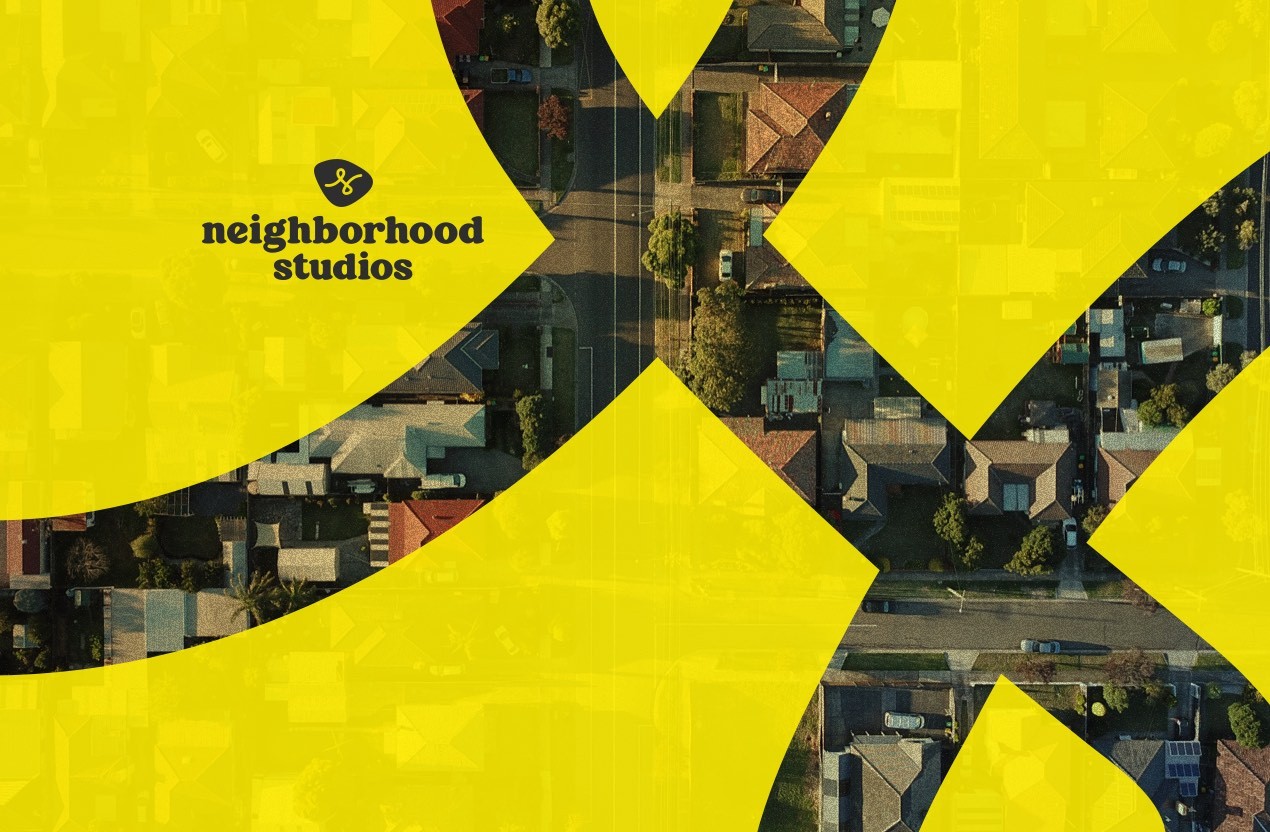
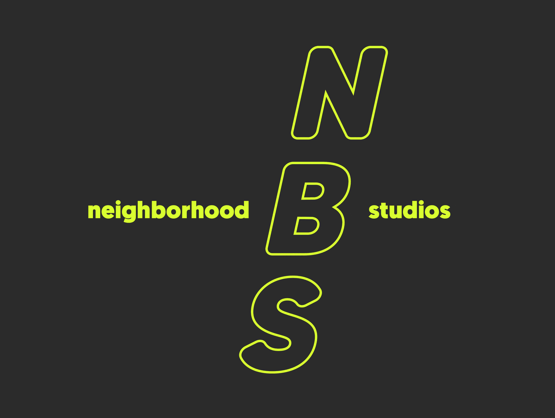
Starting with the logo, we went through three rounds of refinement before landing on a custom line N mark paired with a a friendly serif typeface. Since Neighborhood Studios works with local, scrappy startups, the intention was to show a more personal, handcrafted brand. Once we settled on the logo, I paired it with a color palette that felt bright but grounded. The N mark in its yellow icon shape became the through-line across the website favicon, presentations, and brand materials. I finished the project with a custom typesetting and secondary logo for their motto: 'Only Neighborhoods Can Save Us'.
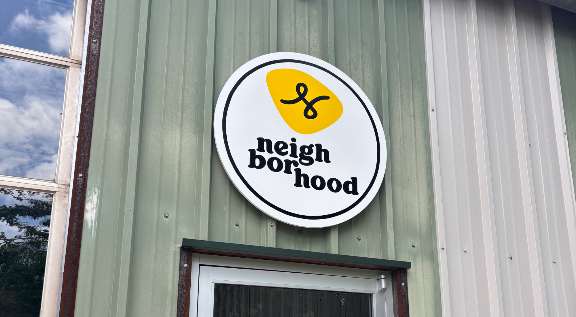
Exterior signage for the front of the office.
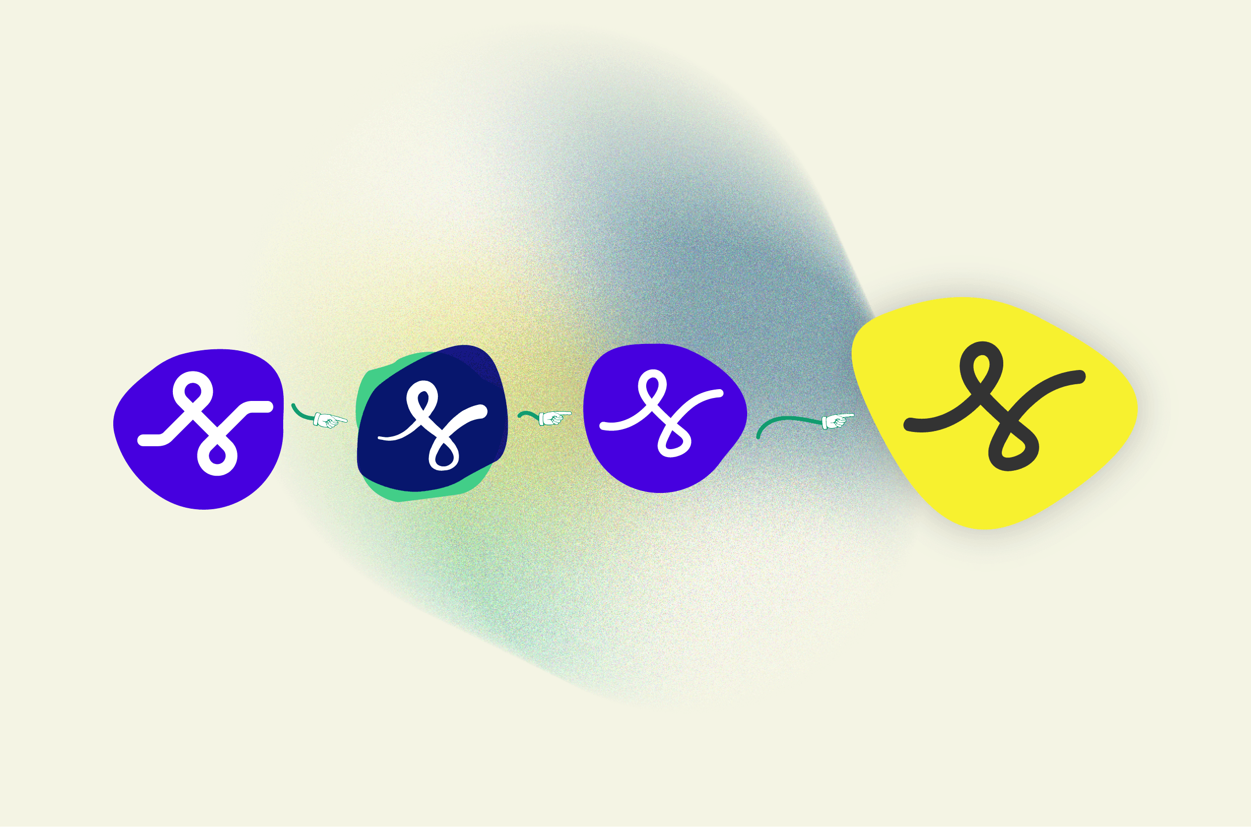
The birth of a squiggle. (Not to scale)

Approach
Having an existing working relationship with Dave meant we could move fast . We started with a moodboard that mixed my references with brands Dave was drawn to, which gave us a shared visual language before any sketching started. Logo exploration happened over three to four Zoom calls where I walked him through my moodboard and Illustrator files directly, talking through the thinking behind each direction. I started in black and white to keep the focus on form, then introduced color in later rounds once the mark was narrowed down to a few favorites. The animated logo exploration on this page shows the range of directions we worked through before landing on the final selection.

Further Reading
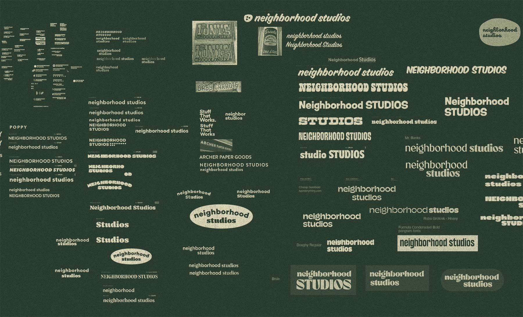
A look inside the V1 logo exploration file. Early directions, rejected marks, and the iterations that led to the final N mark.

Outcome
Dave and I had worked together previously on Scoutmob, which made this project hum along smoothly. The brand launched shortly after we wrapped, including a physical sign above their office entrance. Neighborhood Studios has since recruited founders and launched several startups in the community, including projects like Loop and Dandy in the Decatur area. The studio is still active, and the brand has stayed consistent and unchanged since launch.